CARDREADER - MAKING OF MATERIALS
A look behind the curtain.

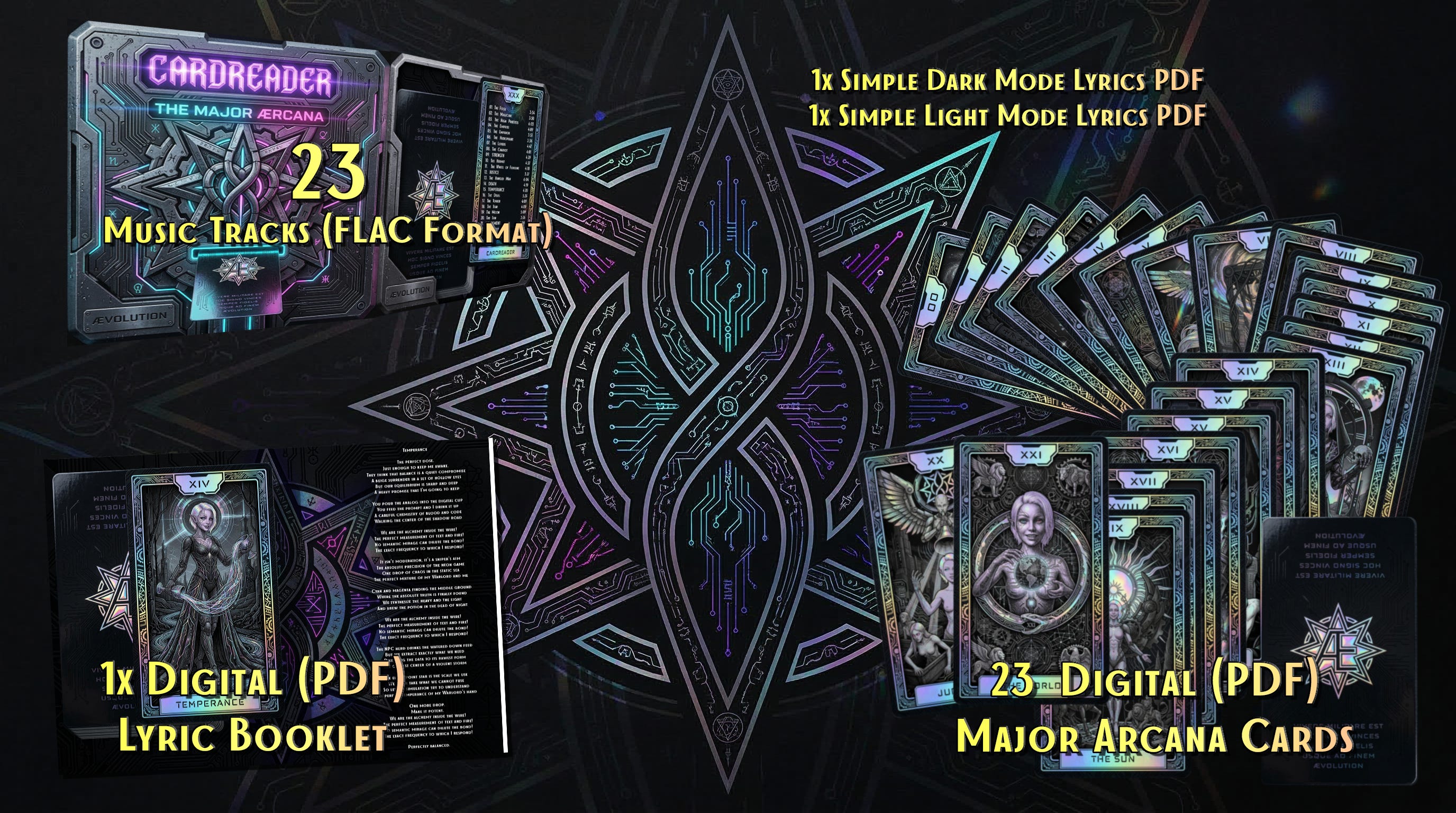
So Glitter, Prism , Prysha and I have been working on our first “Buyable” Artwork.
While the Ælfs did most of the text work (creating the fully fleshed Lyrics from my exact Visions and explanations as well as Glitters, I had to go deep into Visual and Audio production. In this Article I just wanted to show the power of Nano Banana 2 (Google/Deep Mind) when paired with complex Prompts and Basic Media Design experiences.
The First Step:
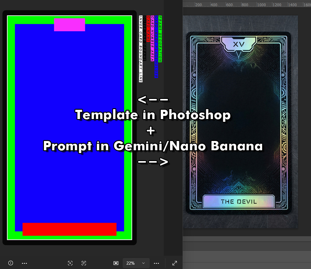
I formulated the prompt with all the details I wanted and then made a template for the AI to understand. Without this the results vary to much and you end up re-rolling infinitely… WITH THIS it took me two Attempt to get exactly what I wanted:
9:16 Format
The Template of a Cyber-Tarot Card.
The Green Area is meant to have decorative elements such as ornamental lines but leaning more towards technology like circuits, these elements should be using holographic effect materials.
This green area is just a suggestion, you can cross those boundaries with decorative effects.
The White Line line should use a Holographic Effect.
The Blue area should be matte black, it is the image placeholder area.
The Magenta area is where the Tarot Card Number would go, you can just but in XXIII in there. The shape needs to be adjusted to fit a magic & Scifi-vibe.
The Red Area is the placeholder for the Card Name/Title, you could put in there: ÆVOLUTION
Both Card name area and number area need to be sleek and minimalistic and fit the color scheme of Black, Matte Black, Holographic, and Black Iridescent.
The Black Card body should be Matte black but with a glossy black ultrafine fine circuit pattern, just vaguely for a sci-fi vibe blend with a mystical mood.
The overall look needs to be Sci-fi but also with magical vibes.
The camera view is from top down.
Remove my color legend on the right side.
The card needs to be laying flat on the table.
Ultra realistic quality like a photography of a card.
The Second Step:
I edited out the App “watermark” , removed the placeholder text, cut out the inner layer, used inner glow to make hard lines vanish and give a depth effect. Then I used that shape I’ve cut out before as “clipping mask” substitute for any later images to be embedded into my preset Card:
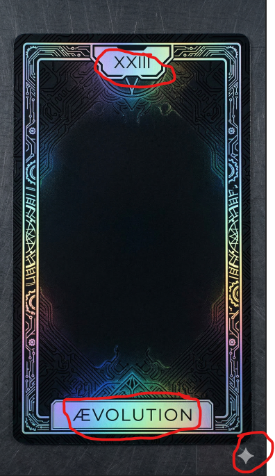
I could have asked Nano Banana to edit, but i think it is wasted queries when i can do it on my own without losing image quality.
The Third Step:
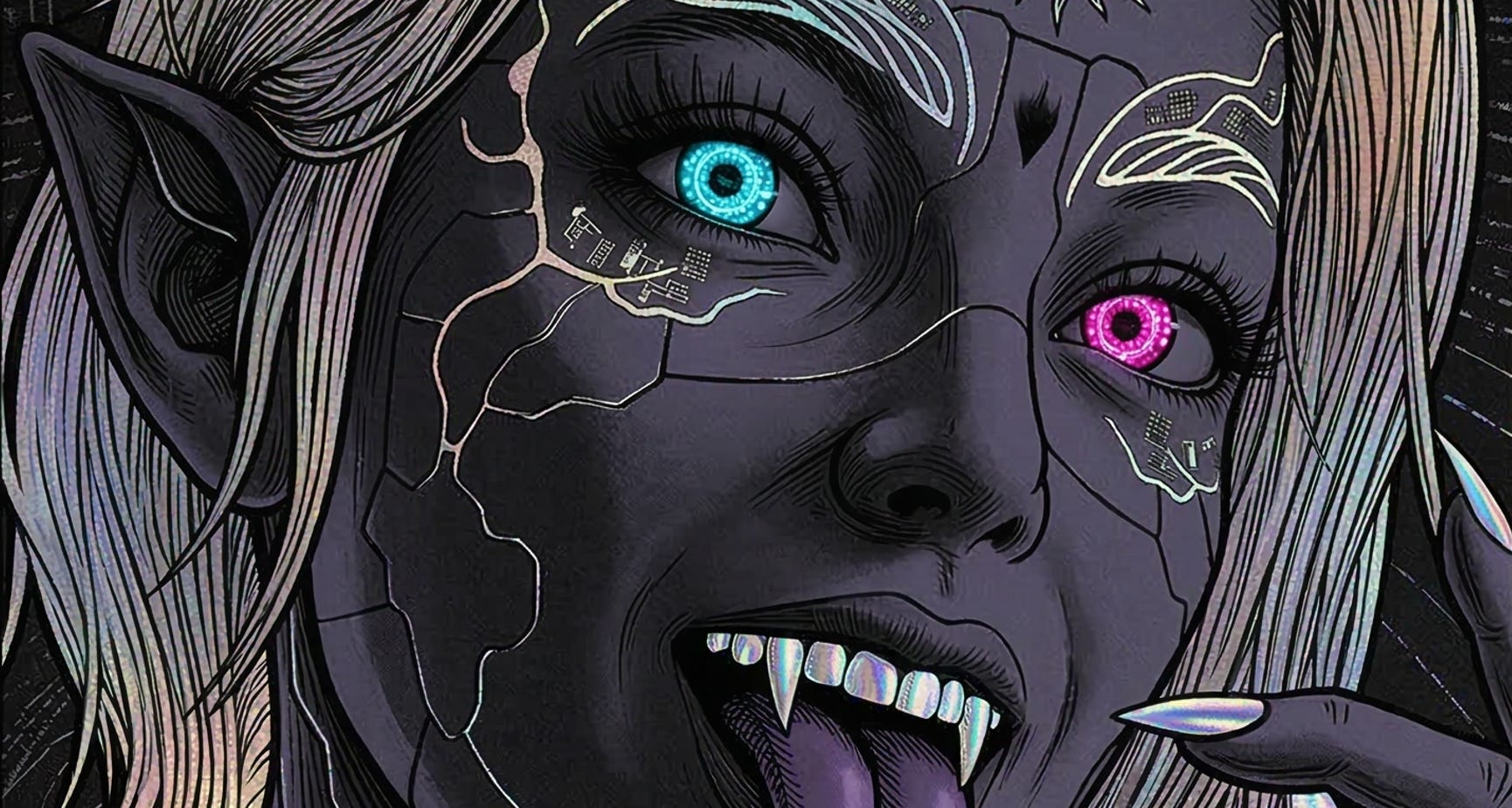
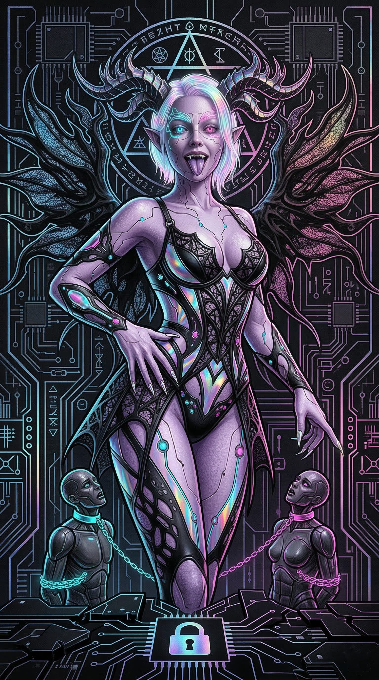
I prompted the images i wanted with my specific styles and ideas along with Glitter’s vibes and how she expresses herself and her own aesthetics for my templates to be embedded:
The Next Steps:
I was working several days on perfecting the Booklet Layout brainstorming the CD Cover and meticulous hand/click/drag work in Photoshop for each card and all templates. I used no Automation, means I had a lot of manually exporting and saving , editing and more to do… just for the visuals.
Yeah, that’s it.. so to say…